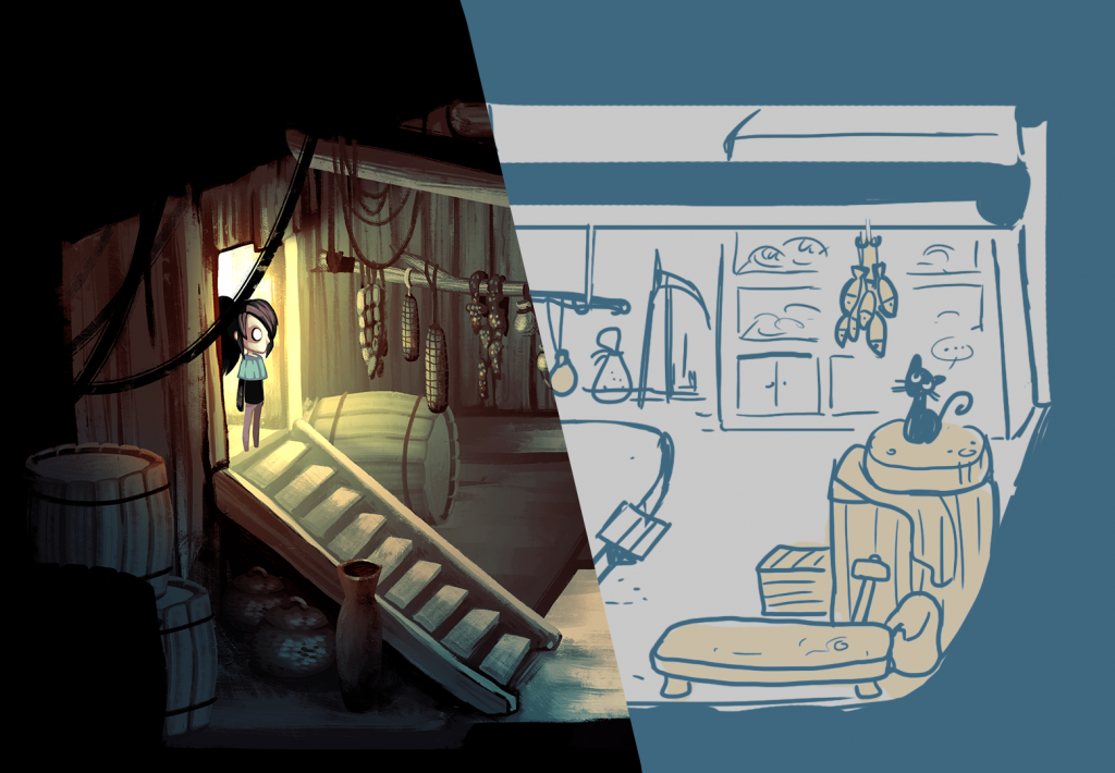
Let’s talk about backgrounds.
Oftentimes, mapping is all about tilesets – grids containing all the elements appearing on the screen, mixed and combined to form the final product. And it works: most of the best works of the 2D Era worked with tilesets, reaching results still impressive as of today with a relatively limited palette of tiles.
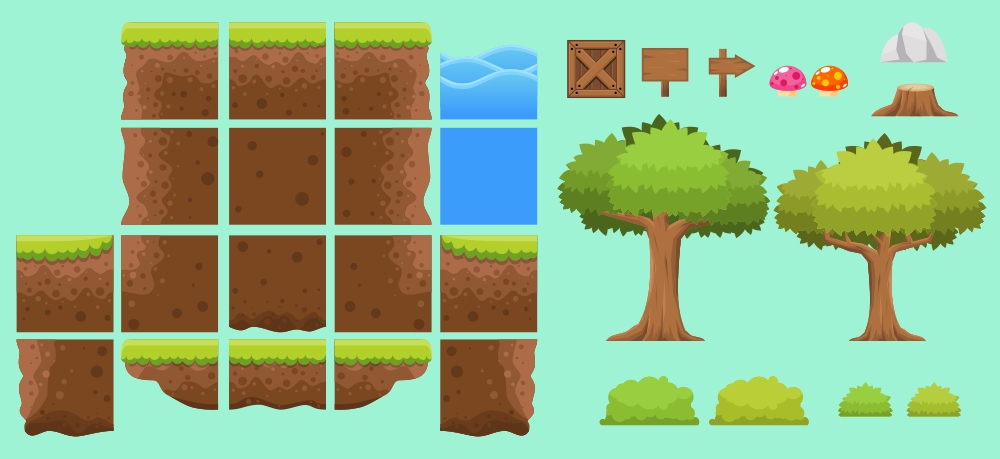
This is not how Children of Silentown‘s maps are made. Tilesets are relatively easy to create and to work with, but they come with a whole host of limitations, from strict adherence to the grid to a fixed number of elements to work with. What our game does is using whole pictures, all of them painted by the very talented Fraffrog.
The process
It all starts from simple sketches of the entire area: usually, they are provided by us, with a list of necessary and fixed elements for the gameplay part of the game, but it hasn’t been unheard of for Fraffrog to contribute with her own ideas to the creative design process. These sketches are tested, commented, and modified as needed, by adding them in the game itself and giving them a ride. By the end of this phase, a working map exists – it just hasn’t been painted yet.
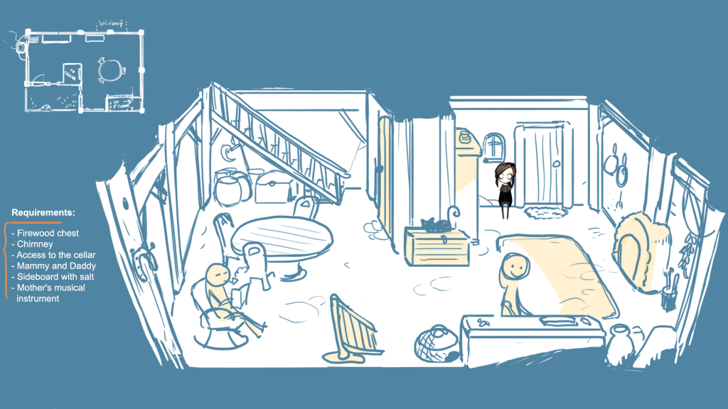
And painting is exactly what follows. On top of the first rough sketch a more definitive guide is laid down, and on that Fraffrog starts pouring a black-and-white version of the final product. This is all that is needed to define the points of light, the shadows, the depths of the map, its details, and broader strokes. Colors can come later – and their choice is, of course, anything but random.
Children of Silentown is an eerie, mystical game, steeped in mystery. The village is set into needs thus to be similarly excised from time, less of a realistic picture and more of an old, sepia-colored photograph from an undetermined point in the past. You will seldom see bright, vivid colors in these maps: all of them have been washed away, present only in their palest forms. But hues are not the only way the village is shown to be an ethereal and not quite mundane location.
Perspective is taken as a general guide more than an iron rule, and few elements are straight as they should realistically be. The final result is out of balance, almost dizzying. It doesn’t give the idea of a grounded, down-to-earth place – which, of course, it isn’t.
Layers separation
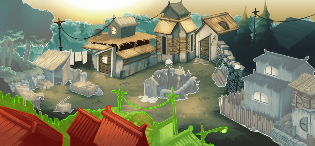
Once the splendid final work is complete, it yet again goes back to the developers. Here it is cut and positioned as needed. Background parallax elements are placed in the back, overhead items are placed above the player character level, and transparency – if needed – is set for those elements that require it.
Reusing
There is a final consideration, and it is about reusing. Fraffrog doesn’t necessarily repaint every single fence, every single bale of hay, every single rock: these are meticulously saved, stored, and reused as needed. This does seem to run counter to the usage of pictures rather than tilesets, but it is necessary to alleviate a couple of issues the project does run into. First of all, time. Children of Silentown is mostly a labor of love, having to compete for time with the authors’ primary occupation (the one providing them with, you know, a wage), which explains the long development time often shared by other indie titles. Reusing some elements doesn’t save a lot of time, but it does save some.
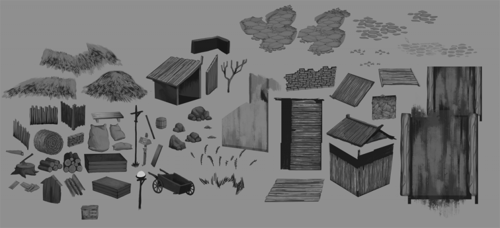
Another reason, and a more delicate one, its internal coherence. The game has been in development for two years now, and in that time, style is bound to change, mostly for the better. This sounds amazing, until you realize that this creates a vicious circle where the old maps look worse than new ones, so you improve them, but your style changes so you have to work on the later maps again, but this creates another gap, and so forth.
Having a fixed set of elements to compare and contrast the new map with helps to ground them all on the same general aesthetic, giving them a layer of consistency that is otherwise hard to reach on the sprawling timescales the game development has to cope with.
This is a slice of our development workflow.
Stay tuned for the next blog post!
Cheers,
Elfs

